Very Peri: A Design Color With Tranquil Energy For Your Life
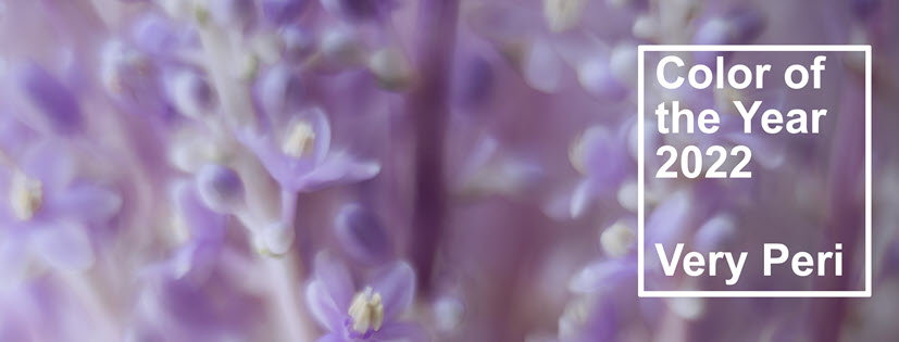
Pantone has announced its Color of the Year for 2022, and it's Very Peri, a color that combines steady, calming blues with energizing reds to create a periwinkle-inspired color. It's "a New Pantone Color Whose Courageous Presence Encourages Personal Inventiveness And Creativity."
Very Peri Offers Tranquil Energy
Traditionally, blues go hand-in-hand with tranquility, trust, coolness, and steadiness.
Reds, on the other hand, capture heat, hot-headiness, energy, and life.
The combination of a blue with a red delivers calm and upbeat energy. As Leatrice Eiseman, Executive Director of the Pantone Color Institute, says,
"As we move into a world of unprecedented change, the selection of PANTONE 17-3938 Very Peri brings a novel perspective and vision of the trusted and beloved blue color family, encompassing the qualities of the blues, yet at the same time with its violet red undertone, PANTONE 17-3938 Very Peri displays a spritely, joyous attitude and dynamic presence that encourages courageous creativity and imaginative expressions."
Two aspects of this color of the year stand out:
- Pantone created a brand new color with Very Peri! This is the first time it has done so in the history of Colors of the Year.
- There's a digital angle with Very Peri. Pantone has partnered with Microsoft to integrate Very Peri into screensavers and Microsoft applications such as Teams, PowerPoint, Edge, and Windows.
>> See Pantone Unveils Color of the Year for 2022
Very Peri: A Brand New Pantone Color
Traditionally, Pantone identifies for its color of the year an existing color in its palette. As CNN explains,
"...It's the first time the company has manufactured a color instead of delving into their pre-existing archive, a decision that was a vital element of this year's selection process.
"It was really important for us to come up with a new color because we have a very new vision of the world now," said Pantone Color Institute's Executive Director Leatrice Eiseman in a video call."
And, Laurie Pressman, Vice President of the Pantone Color Institute, states:
“Creating a new color for the first time in the history of our Pantone Color of the Year educational color program reflects the global innovation and transformation taking place..."
Very Peri: Digitally Connected
"...As we emerge from an intense period of isolation, our notions and standards are changing, and our physical and digital lives have merged in new ways. Digital design helps us to stretch the limits of reality, opening the door to a dynamic virtual world where we can explore and create new color possibilities. With trends in gaming, the expanding popularity of the metaverse, and rising artistic community in the digital space PANTONE 17-3938 Very Peri illustrates the fusion of modern life and how color trends in the digital world are being manifested in the physical world and vice versa."
The partnership with Microsoft illustrates how Very Peri inspires technology.
Not everything about Very Peri though focuses on technology. There's also how to incorporate it into our physical life with special emphasis on design trends and products you might find at Floor Decor Design Center.
What Colors to Combine With Very Peri?
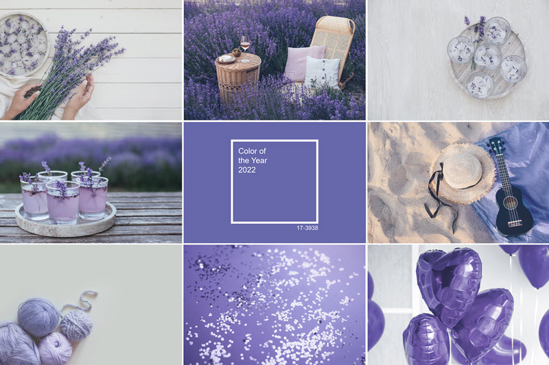
Whether digital or physical, Very Peri needs to play with other colors, textures, and products so as to fully embed itself in our lives and homes. As you can see from the visual above, Very Peri combines well with white, green, pink, and sandy beige tones.
According to House Beautiful's article titled 7 colours you can pair with purple, inspired by Pantone's Very Peri, other options include:
- Blue
- Orange
- Yellow
- Grey
The article shows you combinations of Very Peri with other Pantone colors such as:
- Medium Green
- Skyrocket
- Tangerine
- Yellow Cream
- Navy Peony
- Beige
- Pirouette
- Lucent White
Floor Decor Design Center Examples Inspired by Very Peri
If Very Peri speaks to you, you're in luck! Floor Decor Design Center carries many products that can enable you to fully surround yourself with or just suggest a touch of 2022's new Very Peri.
Very Peri Carpet Ideas
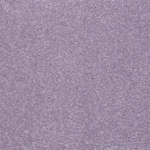
For a solid experience, consider Pop Culture Fancy by Tuftex. It's delicious underfoot and is sure to envelop you with that tranquil energy.
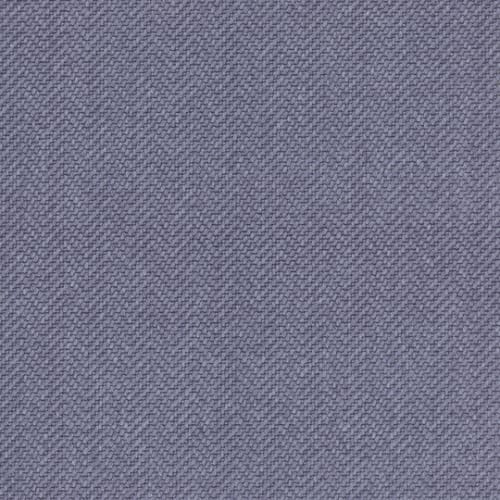
Another solid color with a subtle herringbone pattern is Glitter in Blue Yonder color by DMI.
You may prefer stronger patterns.
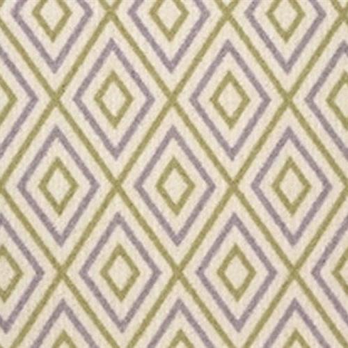
Taos by Stanton in color Lavender Fields combines green and beige with periwinkle in a vibrant diamond pattern.
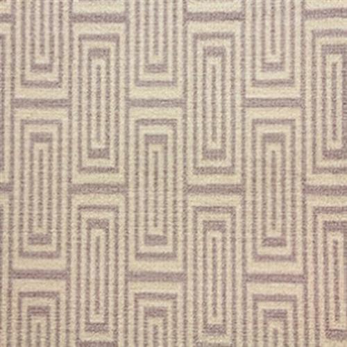
Tesla in Lavender Fields by Stanton is more subtle but equally vibrant with its classic geometric pattern.
For a more nature-inspired Very Peri look, consider Davinci Lavender Fields by Stanton.
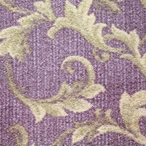
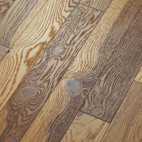
Wood and Very Peri
It's perhaps a stretch to associate Very Peri with hardwood. However, Raw by Anderson in color Natural suggests some of that purple-ish tone. It also combines beautifully with the carpet examples above.
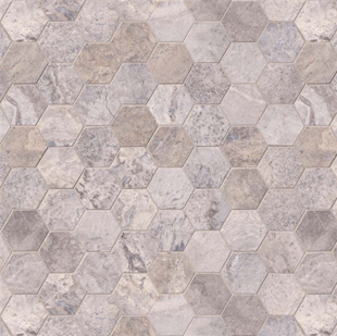
Tile Infused with Very Peri
Silver Travertine hexagon tile from the Specialty Shapes Tile Collection by MSI captures some of those blue/red overtones while adding a touch of timeless beauty to your installation. Imagine this product combined with an accent wall painted in Very Peri!
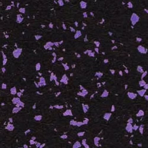
Very Peri in Rubber Flooring!
Very Peri can motivate your physical energy, too, especially when combined with a bold Rubber Floor in color Deep Purple by Advanced Edge.
The possibilities are endless, inspiring, and quietly energizing.
Previous colors of the year include:
>> VIBRANT YELLOW + ULTIMATE GRAY = 2021 COLORS OF THE YEAR
>> ADD CALM AND STABILITY TO YOUR FLOORS AND WALLS WITH CLASSIC BLUE
>> BRING YOUR FLOORING TO LIFE WITH LIVING CORAL
READY TO ADD Very Peri TO YOUR FLOORS AND WALLS?
Are you ready to add a dash of Very Peri to your home?
If you're interested in doing so, we invite you to explore one of our two showroom locations in Middletown or Orange so you can be personally inspired by what's available.
Let us know of any questions in the comments or contact us.
We look forward to helping you.
Thanks for reading,


